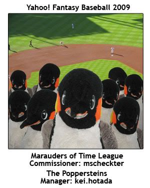
I found yesterday's photos to be kind of uninspiring. I also overlooked a gem from previous days. So here are the "Photos of the Day" for yesterday.
 May 24, 2009: Matt Palmer avoids a BEE
 May 26, 2009: Nick Swisher spreads the love as storms brew above
 May 26, 2009: Zack Greinke went nuts again yesterday. I really want photographers to catch these folks when Greinke has three strikeouts. Maybe they just wait for the fourth one and tack the third and fourth "K" at once.
EDIT
 May 26, 2009: This picture was hiding in the wrong folder. Bartolo Colon pitched awesome last night despite being really fat and old. Amazing!


That is a super mystical header, Kei. Well done and THANKS!!!!!! I love the way Papi looks as he prepares to head into the uncharted depths of the universe. He's like, "Yeah, my time has come. Goodnight y'all and peace over."
ReplyDeleteHaha, thanks Jenni. That was when Papi got hit by a pitch and Joe described the look on Papi's face as being happy to get on base.
ReplyDeleteWhile I'm at it:
The squirrel was from a day out on CitiField early on in the season; Garza gave up a run or maybe even a homerun right before that photo was taken but he's still got a little creepy/scary grin going; and that picture of Miggy on top is of him avoiding being hit by a pitch, from last year.
Credit should go to Mordecai for making those floating Swisher and Greinke heads more aesthetically pleasing (I don't know how to make things fade like that).
Re: the selection of players, it was a tough decision but I mostly kept composition and balancing teams' players in mind. I also didn't want anyone with ugly faces/expressions or lame players. So it was a bit of a puzzle, but I finally got it done!
sorry been sleep on the blog
ReplyDeleteand baseball in general
never got around to looking up photos for last weeks beasts
not positive ill make time for it this weekend either
wasnt there a yankees squirel
poley walnuts
i think the fade started too high for greinke/swish
but i guess you wont confuse them for severed heads
im not a fan of the font either
but thats just nitpicking
i cant compose anything nearly as well put together as this
well done
I think you can just put up a picture of Joe Mauer for last week's beasts and that'd be sufficient.
ReplyDeleteThe fade/gradient is a weird effect. Mordecai taught me over the phone for Nik's flyer, where I overused it to get rid of awkward edges. It makes little sense to me as I know it.
It's hard to pick a font, I never realized since I had previous luck for the birthday bash (although I can't remember the name of it and Photoshop doesn't have previews so it'd take forever to figure it out by POE). I just looked up "scifi" fonts at dafont.com. It was either this, "Galant," or "GAMECUBEN," which I used for Nik's flyer.
wait was that squirrel always there?
ReplyDelete